Until yesterday, the section dividers (the hr elements in the HTML) on this website were incredibly plain, just one pixel lines across the column. So I thought it would be good to gussy them up a bit to add a bit of flavor to the design.
I didn’t have much of an idea of what sort of look I wanted to achieve. But being both a design guy and a code guy, I jumped right into the CSS and started playing around. After monkeying with it for a while, I landed on something I like reasonably well, which looks like this:
It was easy enough to achieve with CSS, a couple of dotted borders, a little height, and some negative margin on larger screens. Badda-bing, badda-bango.
But most designers aren’t also coders. And while in the department where I teach, we do require students to take a basic HTML and CSS class, I’d never expect them to do their designing directly in code. After only one semester’s practice, they don’t have the mastery of the medium needed to really see the range of possibilities. So we teach our students to do what most designers working in the digital realm do—they create mockups and prototypes to pass off to a developer for implementation. The coding class is there to give them enough familiarity with the medium to make informed decisions, but the creative work is done in design software (and sketches!).
Here’s the thing, though: If I had opened Figma or Illustrator to knock out the design, it almost certainly would have come out differently. And I betcha dollars to donuts that when I coded up whatever that ended up looking like, the code would have been a little less elegant because I wouldn’t have been considering that aspect when designing it.
I suppose the difference is one of nativity (not the Jesus kind). There will always be a qualitative difference between working directly with a medium versus making an abstract plan for a someone else to execute.
I’m reminded of the difference between writing music on the instrument that will play it versus composing for an instrument on paper. When composing on paper, it’s hard to be really dig into and embrace the nuances of which a particular instrument is capable. Some great composers are fluent enough to really write to the particulars of the instruments (I’m thinking of the fantastic trombone slides in Ravel’s Bolero or the opening clarinet part in Gershwin’s Rhapsody in Blue). But most of the time I can tell when a drummer is playing from sheet music; the raw intensity’s just not there.
That’s not to say there aren’t some distinct advantages of not composing (or designing) directly in the ultimate medium. River’s Cuomo of the band Weezer (I’m not much of a fan, but this is interesting) says he composes guitar solos by singing them because it forces him to pause for breaths and to work in short phrases. This is a great example of understanding and working with the question at hand.
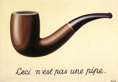
I think the key thing here is to always be aware of the relationship between how you choose to design something and the ultimate media in which it will be expressed, and of the feedback loops that relationship might create. I think perhaps René Magritte expressed this best in his landmark painting The Treachery of Images:
